You nerds like t-shirts and other apparel, right?

It’s been some considerable time since I last updated this blog but it seems like it’s still getting hits and I am *desperate* to get back in to making more artwork sometime very soon (when I’ve moved house) so I figure it’s time for an update.

I tend to post everything to my Tumblr blog usually (link here) and use this a lot less, so I’m not sure if I’ve ever made a post about the t-shirts I’ve got now and I’m far too lazy to just check my previous posts!

20150914024406_WYSmOWccLLrvnJfh

So yeah I’ve got shirts and stuff.

I used to use Spreadshirt and Society6 for all my shirt related needs (they still exist, and have unique designs of their own on there if you’re interested [Spreadshirt Link]/[Society6 Link]), but nowadays I’m all about LiveHeroes.

I did a giveaway on my blog (now closed :P) when I first started up the store as a means of getting free advertisement on Tumblr – and the winner got the above shirt from me for free! The quality of the shirt and the printing is great apparently, which is awesome to hear. I worry sometimes when using these online printing services that it’ll be kinda…not good.

But hey, Live Heroes is the site that Dustrial uses so how could I possibly go wrong?! :P
(One of my designs is a total rip off of homage to the classic Dustrial style.)

I really like the designs I’ve put on there now (most of them anyway) and totally want some of them as shirts for myself. If only I wasn’t so cripplingly poor!

So to remedy that here’s me, begging you fine folks to buy my wares so I can afford to buy them from myself!
Always happy to work with folks on bespoke designs if you have any particular glitchy needs that you want seeing to.

And they don’t just do t-shirts! They do leggings, hoodies, and dresses too!

I really want to get a pair of leggings and just wear them under my jeans so that every time someone is like “So what kind of art to you do?” I can be like “THIS” and just rip off my tearaway pants to reveal the glory underneath.

I’ll take photos if I ever do :’)

Live Heroes have put leggings on the “women’s” category of clothes but let’s be real, we don’t have to adhere to society’s expectations of gendered clothing! I’ve got great legs. They’s suit me just dandy.

Gender roles are arbitrary and weird.

What kinds of clothes/designs would you folks like to see more of?
What designs that I’ve done already do you like/dislike and why?
Let me know in the comments!

Here’s some more eye candy for you, but check out my store for more!

LIVE HEROES

SOCIETY6

SPREADSHIRT

tumblr_nuqt2siIuJ1qey76no1_500

Also, do you guys want me to post more often or have you abandoned me for dead long ago?

CRT TV GLTCH: Behind the scenes of QuestionSomething.

ALSO AVAILABLE ON TUMBLR.


Alrighty, kids! You want it, you got it.

Time to dispel some of the glitchy mystery. If you want to maintain the veil of not knowing how it’s done then don’t read this. But if you’re a brave glitch wizard in training who wants to learn from another acolyte of technomancy then follow me down the rabbit hole…
This is my workstation when producing a good number of my still-image CRT TV glitches.

01-P1070001

Welcome to my bedroom. Don’t mind the mess.

My camera is a Canon EOS 550D/Rebel T2i sporting it’s basic 18-55mm lens. It’s sitting in it’s usual position; on a tripod pointed at the old TV/DVD combi that used to be in my sister’s room when I was a kid.

When I experiment with manipulating VHS tapes (something that I’ve still only just begun to experiment with) then this is how I capture the material. The camera captures something that our eyes just don’t regularly see. Ignore your parents and get real close to one of those big-butt TVs if you’ve still got one. That’s a cathode ray tube television (CRT TV). Get closer. Check out those pixels.

IMG_68243IMG_68242

What we’ve got here is a beautiful arrangement of red, green, and blue. Each triplet makes up a single ‘pixel’ on this screen.
The changing intensity of each colour changes what colour we see while watching TV, but don’t be fooled. All you’re seeing is a collection of red, green, and blue lines (or other times spots) that our brain is interpreting as other colours.

I’ll let Vsauce field this one. He starts off talking about the yellow that we see from TV screens, then starts a new lemon-related subject at about 2:17.

If you’re not interested in this at all, then skip the video.
You monster.

So my camera sits in front of my TV screen and captures whatever I put on the screen. I’ll leave talking about VHS manipulation for another time, because that’s not what I’ve been doing lately. The key to my current technique is this little fellow.

03-P1070003

This is a VHS to video converter, and I got him off Amazon.co.uk for just over £10.

Now what this does is to make it possible for me to display content from my laptop or PC on my old CRT TV.
Originally I had tried a VGA to RCA cable. Just a cable. I figured that that was just too simple, and I was right. It doesn’t work that way.

The video signal going from my laptop is too different to the kind of signal that my television can interpret. When I used a cable alone, with no converter, I ended up with stuff like this.

P1040063 (2)

This was…well actually this was pretty damn cool as well and I still use this cable from time to time, but it wasn’t what I was aiming for!

In order to display the content from my laptop on my TV screen I would need a converter; and this one has not disappointed.
It’s very simple to set up. Powered by a USB cable (which can be plugged in to either your laptop/PC or in to a wall socket if you’ve got a USB plug…thing) all you do is plug the VGA cable in to your machine, then in to the converter. Then you take your RCA cable from your converter to your TV screen and set your TV to the right channel.

20-P1070020 21-P1070021 22-P1070022 23-P1070023

By default my TV showed a duplicate of my laptop screen, but I changed the settings to extend my display and use the CRT TV as a second monitor so that I can go full screen or manipulate things on my laptop without disturbing the display.

This VGA to RCA converter has a selection of really helpful settings that can be changed using the buttons on the side of the device. For this tutorial example I’m using an image that silicongene submitted.

16-P1070016

18-P10700182

The settings are pretty basic. Most people will be familiar with what they each do already. You press menu to bring up the settings, navigate through the up and down arrows, and change them with the left and right arrows.
The zoom button basically just zooms in by a little bit. Not a lot to be honest. Then when you press it again it returns to normal.

OSD Background refers to the black background to the menu text.
Flick refers to the ‘flicker’. If the image is ‘flickering’ slightly, or there is an offset like you can see in the image above, then this can be used to correct it… I usually do what I can to try to make it worse.

10-P1070010

And we’re here. You’ve got your VGA to RCA converter all set up, the content from your laptop set up on your TV screen and your camera on a tripod pointed at the screen ready to capture. Once you turn out the light to reduce any glares and reflections what do we do next? How do we glitch?

Are you ready for this? It’s a real doozie. A very complex series of actions that requires a lot of concentration that most can’t wrap their heads around it.

Particle physicists would struggle to perform the actions that I’m about to reveal to you so sit up straight, grab a pen, and pay attention…

You grab your VGA to RCA converter…
And you wiggle the RCA cable around a bit.

Untitled-12

Wait, did I say complicated?

I meant to say it’s REALLY SIMPLE AND ANTICLIMACTIC.

But before you unfollow my blog, eat a whole tub of vegan ice cream, and cry profusely in the shower just give me a second and let me tell to you a thing.

This works really freaking well.

What I’m essentially doing is taking the RCA cable and only letting it partially connect to the device. This makes the picture go crazy wild a lot of the time, interspersed between areas of it not doing anything at all. When you’ve got a camera set recording the screen at full HD, 25 frames a second, you end up with a good number of wonderful frames to play with. The camera captures those wonderful fleeting moments.

I use Abobe Photoshop CS3 Extended for my work, but I’m pretty certain that GIMP also has this same feature.

“Import > Video Frames to Layers…”

frames

From there you are presented with a window where you get to select your video file. I imagine that GIMP might handle video files better, since it’s not an Adobe product. But Photoshop tends to only like QuickTime Movie files (.MOV files). Fortunately that’s what my camera shoots in, but if you want to use Photoshop there are various media converting programs out there that can do the job for you.

Quick Media Converter is one that I can recommend, and is absolutely free.

Once you’ve selected the video file that you want to import in to Photoshop you’re given another dialog box with a few other settings.
You can select what area of the video to import, how many frames, and whether or not you want it created as an animation as soon as you import it.

frames2

From beginning to end any video file less than 15 seconds long imports in to Ps very quickly for me giving me all the frames I needed.
After that you’re left with the task of going through and looking for any frames that you like.

I generally get a good amount of footage each time that I do this, and I’ve never not ended up with a large selection of wonderful frames to choose from.

Like this.

Untitled-5

Or this.

Untitled6

From there you can do what you like with them. Alter the brightness/contrast/saturation, use them in other designs, upload them as they are, turn them in to an animated gif; whatever takes your fancy.

Something that I would love to do is to develop something else that goes between my laptop and my TV either as well as or instead of the VGA to RCA converter. Something circuitbent. Maybe just a circuitbent version of the converter itself.

The only problem is that I don’t know enough yet to make such a device! But I’m working on that.

A project for the future!

I hope this little behind-the-scenes look has satisfied you all.
This process isn’t a terribly complex one. Anyone can do it if you’ve got the bits and pieces that you need!
If you’ve got any other questions, or if there’s anything else that you want to see a behind-the-scenes look at, then let me know!

Until then, happy glitchin’.

eye2

How to pixelate an image, for glitch art or otherwise.

People sometimes ask me, “Pardon me, fine sir, but I am most impressed with your pixelated glitch work. How does an individual achieve such a desirable aesthetic?”

It’s a very good question, old bean. While there are no doubt vastly superior and more detailed tutorials on the subject floating around the Galactic Network I thought I’d take the time to outline the method I currently use to create various pixel-related effects. I’m not the best at explaining things, but bear with me and you might just learn something!

**Click the photos to see full size!**

For this experiment I shall be using another photo of an adorable animal; for continuity purposes, of course.

Meet Cobra!

He’s my friend’s dog and an outstanding little chap! He also rocks a monocle.

But let’s crack on.

Aside from painstakingly applying each pixel by hand, one at a time (which I’m sure some extremely talented people actually do) there is one quick and easy way to pixelate an image. I am working in Photoshop CS3 again for this but you may well be able to use this technique in GIMP, or other image manipulation software.

Once you’ve opened up your image in Photoshop you go to File>Save for Web & Devices…
Or, alternatively, you can press Alt+Shirt+Ctrl+S.

This will bring up the Save for Web & Devices dialog box. If you’ve ever made a GIF in Photoshop before then you’ll be familiar with this already. There are a variety of settings, but at the moment it doesn’t look too different from the original does it? If I zoom in however…

…then you can see that it has in fact pixelated Cobra’s eye! But at full size the image looks no different. That’s because this image is as it was when it first came off the memory card. It’s still at full size. I’ve pixelated the image, but there are a LOT of pixels to work with. Let’s cut that down.

I’ve cut the pixels per inch down to 72 and the width down to 500. For web, this would be an *alright* size. For quality, it doesn’t matter too much how small you make it. But the size of the image does have an important impact on your outcome – I’ll come to that later on. For now, let’s open the Save for Web & Devices dialog box again.

Okay! Now we’re getting somewhere!

Take your eyes off the dog for a second and look at the settings on the right. In the first dropdown box you can see what the image will be saved as. I always leave it as a GIF, just because it works, but I think a PNG would do just as well.

Underneath that you have the Colour Reduction Algorithm. Basically, it’s just a selection of different way that Photoshop will manage the colours. Here it’s set to Restrictive (Web), and across from that you can see how many colours it has to work with. Right now it’s 64. Let’s cut that in half.

You can see that’s made a difference, but not a hell of a lot. What this gives us a chance to do though is to move past the rest of the settings for the moment and look at the Colour Table. Here you can see all of the colours being used to compose the image. And the best part? You can change all of these just by double clicking on them and selecting a new colour.

See how I’ve changed one of the lighter colours to red, and one of the greens to blue? All of the pixels that use that colour have been changed in the image. You can either use this to might certain colours brighter or darker, or just to mess with the colour scheme entirely!

When you change a colour the icon for it splits in two. The top left half is what the colour originally was. The bottom left half shows what you’ve changed it to. If you’ve made a mistake and want to revert a colour you can just double click the icon. The selector will return to the location of the original colour and all you have to do is click OK.

Alternatively, if you want to reset ALL the colours then hold the ALT key and press the Reset button.

You can also press the Remember button to make Photoshop remember your colour settings. I know, I know. If I hadn’t have told you you’d never have guessed.

“But wait,” I hear you ask, “What if I don’t want it to be in colour and just what a black and white pixel image?”

Good question, amigo. Well, do you remember when I showed you the colour reduction algorithm? How the drop down menu is set to Restrictive? Give that a click and select Black and White.

Boom. Black and white pixels.

It’s basically the same as changing the number of colours to 2, but this way you can quickly flip between the two. Photoshop does its best to differentiate between the colours and shades, but there’s not a lot of difference between the background and Cobra here is there? It all kind of blends together.

You can fix that by either cutting around the subject and removing the background, or you can increase the contrast between the subject and background so it stands out more! The how is up to you, it depends entirely on what you’re doing and how you want it to look.

Right. Now is a good time to talk about something new; The Dither Algorithm. It’s located under the colour reduction algorithm and mine has been set at Pattern. I often use pattern because I prefer the aesthetic but here are the four different settings.

NO DITHER: You’ve turned the dither off. All of it. There’s not even a little left. You ate everything. As a result, Photoshop has done its best to cut the image in to two colours as solidly as it can.

DIFFUSION: On this setting Photoshop seems to try to dither the image as closely to the original image as possible. This is also the only setting where you can decide how much dither you want by using the percentage slider to the right.

The first image is at 100% dither while the second is at 50%. See how at 50% the image looks about halfway between max dither and just setting it to No Dither? Yeah, that’s right. It works exactly how you’d expect.

PATTERN: You’ve been looking at this one already. Like I said, I prefer it but it’s entirely up to you which setting to use. I just like the…well…the patterns it makes.

NOISE:  This one’s a very distorted setting, as you’d expect. I guess you could say that it tries to ‘blur’ the edges but I’m sure you know how noise works by now. If not, you can always just try it out and see for yourself.

For now, I’m going to flip back to Pattern.

You might be sitting there thinking that I’m done. That’s it! You can pixelate things and you can change the colours! Time to go home! Well, you may well be able to do that. You could take what you’ve got now and go explore, but I’ve got a few more tips to throw your way yet.

What if there are too many pixels there? What if you wanted the pixels to be larger, and fewer in number; something a bit more retro looking? This is where the size of the image really makes that difference.

The detectives among you will have realised by now that the smaller you make an image, the fewer pixels there will be for Photoshop to work with. Let me show you.


I’ve made the image much smaller. It’s only 200 pixels wide now, but when I open the Save for Web & Devices dialog again you can really see the difference. But, of course, the image is very small. 200 pixels wide? That’s only about the same size as your Facebook profile picture thumbnail. But trust me, give it a name and save it as a GIF.

————————————————————————————————————————————–
[OBJECTION!] “You don’t need to bother saving it as a GIF! Why are you telling these poor folks to use the Save for Web & Devices dialog when you could just go to Image>Mode>Indexed Colour instead?!”

Ah yes, there is indeed a second method of achieving the effect that you can see that doesn’t involve saving a separate file on your computer. This entire method is a roundabout way of converting the file to Indexed Colour. But, while this other option IS there I prefer to go through the process that I’ve outlined here.

If you go through Image>Mode>Indexed Colour you only get this tiny box to play with. It reflects the changes on your canvas, but there’s no colour table and I find it to be generally less usable. You have to go through Image>Mode>Colour Table in order to change the colour, so why not just do them both at the same time?
————————————————————————————————————————————–

So you’ve saved your GIF? Good. Now open it in Photoshop again. You’ll be faced with just the one layer, your image. It’s only 200 pixels wide but you can zoom in as much as you like and the lines will never change. As long as the colours are indexed it’s like working with a vectored image.

Let’s go and pump this baby up to 800 pixels wide and see what happens.

Oh hey, all that happened was that the image became 800 pixels wide. Brilliant!

But something to note is this. 800 is a multiple of 200, so the square pixels stayed as squares. Let’s see what happens if, instead of making it 800 pixels wide I made it 523 pixels wide.

I’ve zoomed in a bit more for this one so you can see it better. Everything has been slightly elongated because it’s trying to reinterpret the image at that size.

So remember, to keep the image exactly the same when resizing it you need to make sure the new size is at least close to being a multiple of the old size. Otherwise there will be some distortion.

Now, when using Indexed Colour you’ll find that Photoshop doesn’t like allowing layers. One way to combat this is to simply change the colour mode back to RGB/CYMK/Whateveryouwereusingbefore. As long as you don’t change the size of that layer again then the edges of the pixels will remain sharp and crispy.

Because of this resizing thing it means you can convert an image to indexed colour and then slowly shrink it down to see how it looks, until it reaches a state that you like. Personally, I like using this on text to pixel it up.

As you can see, if you make the text smaller it becomes more distorted. I think that’s a very cool effect, and that’s just using one font, so try it for yourself and see what happens!

But for now, I think that’s everything I have to offer on the subject of pixelating images using Photoshop. It can be a great addition to glitch art images, or just used to make some interesting pixel looking stuff. Go wild with it! Break the mould and experiment!

Got more questions? Feel free to drop a line and I’ll get back to you as soon as I can!

Databending using Audacity Effects

A semi-complete documentation of Audacity Effects on image files.

This can also be found on Tumblr, if you prefer.

When pursuing the wonderful practice of databending I think that experimentation is all important. Discovering new ways to do things is a key element to the entire experience. But I also know that without tutorials from Antonio Roberts (HelloCatFood) and Stallio (AnimalsWithinAnimals) I wouldn’t have taken the steps to really engage in the subject. They acted as a gateway for me to try new things and experiment with other ideas.

If you’ve never encountered it before, I highly recommend checking out Antonio Roberts’ tutorial on databending with Audacity, which can be found here.

If you’ve never heard of Audacity, then here is the website. It’s a free audio editing program with tools to cut and paste sound and to add effects, but it can also be so much more. With just the touch of a few buttons it can take an image and corrupt its form to create something entirely new – and the process is fascinating.

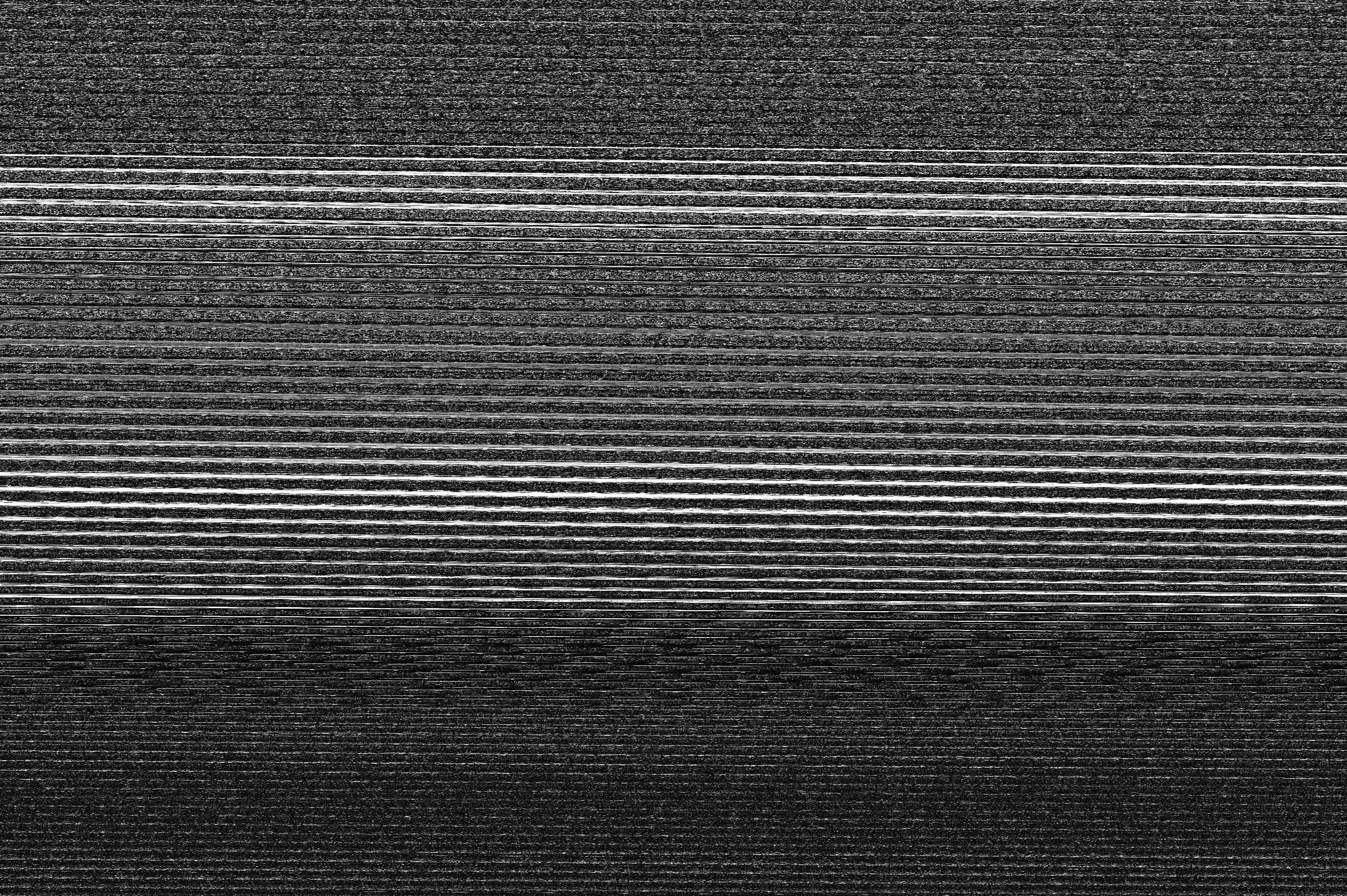
Following Antonio’s tutorial, you can trick Audacity in to opening an image file as a sound. Not only does this give you a sound wave which you can manipulate and bend to your will, but a lot of files sound pretty funky. A bit like if you put a Decepticon in a blender with a couple of R2 droids.

The easiest way to manipulate a file in Audacity is to select a section of the file and apply one of the built in sound effects to it. Now I’m no computing whizz kid but the way I see it when you apply a sound effect to a sound file, the program takes that file and alters the file data in the manner which it’s been told will achieve that effect. So, for example, if you were to apply an echo effect then it would repeat parts of the file, diminishing the repetition after each iteration. The wonderful thing is that it will do this regardless of what the file actually is. Audacity doesn’t know or care whether the file is a sound or not, it will alter it in the manner instructed.

When applied to an image… Well let me show you.

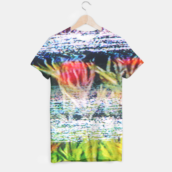
This is a photograph of a fence. You know this. But look what happens when I apply an echo to it.

Pretty neat huh? It somehow LOOKS like you’d imagine an echo on an image to look. Let’s try cranking it up to 11 and seeing what happens when we put a lot of echo on to it.

Phwoa, Melinda! That’s the good stuff.

So, you get it now right? Audacity can be used to manipulate files. Brill-o! Time for us all to go nuts and figure out what all those effects do! Me? I’ve already gone through and tested them all, one by one. What other way of finding out is there?

What’s that? I’ve compiled a catalogue of images that display what each of the built in sound effects do to an image? Oh snap, you’re right!

As I’ve said, experimentation and discovery are a huge part of making glitch art. After messing around in Audacity and trying out all the effects I ended up with the following selection of images for my own reference. I had a lot of fun testing things out on different images and seeing what happened and I wouldn’t want to rob that from you! But I’m also an advocate of sharing these ideas and processes, so if you want to cut those corners and go right for a certain look then here’s a semi-complete list of all the built in sound effects Audacity has to offer!

Consider this to be your Action Replay. The Konami Code of Databending with Audacity. The trip to GameFaqs when you couldn’t figure out that you could just pick up the idol and walk to safety. The…wait what was the question?

THE PHOTOGRAPHIC BASE

Oh right! Well, for this particular experiment I’d like to introduce Jarvis.

He’s the neighbour cat who keeps coming in to my garden and chasing off all the birds. Remember that – it’s vital to the process of databending.

I took the photo on a Panasonic Lumix LX-5, using the miniature setting for kicks. I imported the image on to my Windows 7 laptop and resized the file in Photoshop CS3 to be 800×533 pixels wide at 72ppi. I tell you this, because different sized images manipulated on different operating systems using different versions of different programs could have an effect on how the image turns out.

I then saved it as a BMP and a non-interleaved TIFF file. The non-interleaved (PER CHANNEL) part is an important factor.

What’s inside the red box is important. The first T in important is not so. Ignore it’s lies.

What this does is it saves the colour channels of the file separately as you can see by the RRGGBB, which stores all the red values, green values and blue values together. I won’t go too far in to that, but because each colour channel is being manipulated separately it can cause some very interesting colourful effects. When opened in Audacity, you’ll get three ‘sections’ where the colour channels start and end. There’s usually a big jump in the sound file that indicates where one ends and one begins, which means you can select which colour channel you want to manipulate.

I’m also using the latest version of Audacity at the time of writing this, which is version 2.0.1.
So, without further ado…

NO EFFECT

The first thing to note is that you sometimes don’t have to apply any effect to the image at all for it to be slightly changed. Here you can see that the brightest areas of the image have a grain on them now. I originally thought this was a side effect of the amplification process, but actually it turns out that this is just the distortion that happened when Audacity tried to interpret the file. So in all the images that follow, ignore that grain!

AMPLIFY

As you can imagine, amplify just changes the volume of the ‘sound’. This pretty much just makes the image darker, more contrasted and generally more intense.

When using a TIFF file and applying the effect to the entire image it has the same effect as on a BMP, but when amplifying sections of the colour channels you can increase or decrease how much of that colour there is. For example, you can see here where I’ve increased how much green there is by amplifying the sections.

AUTO DUCK

I was disappointed to find that this did not in fact turn Jarvis in to a duck. Ducking seems to be when you lower the volume of a track so that another track can be heard over it, like if you were doing a voice over to a video and wanted it to be loud, but then quieter when you were talking so that you could be heard. Without there being multiple tracks this doesn’t seem to have many uses other than basically being another way of ‘amplifying’ your image. But hey, go wild!

BASS BOOST

The bass boost effect is rather volatile. Below, I applied varied levels of boost and frequency to the image but each one drastically altered it. Below the first image you can see how it looks at low, default and SLIDERS-AT-THE-TOP levels of bass boost.

I don’t know about you, but as far as abstract patterns go I rather dig it! And it gets even better if you use a TIFF file! Huzzah!

CHANGE PITCH

One of the things about these files is that you have to keep them the same length as when they started, otherwise it doesn’t work. Changing the pitch of a file seems to alter the file’s length a tad, which means that applying it straight on to the ‘sound’ doesn’t yield a useable result.

What you have to do is make a duplicate channel with the same ‘sound’ file on it, then apply it to that. Then, select that section of pitch changed audio and measure its length. Then you need to remove that exact amount of sound from your original track and remove it using the split cut feature. It sounds tough, but if you split the pitch shifted section from the rest of the track then Audacity ‘snaps’ your selections to the edges of that section. Let me show you.

So you delete that section in the top track, and then drag the split selection from the bottom track in to its place. This replaces the section of unaltered sound with the pitch shifted sound without changing the length of the file. But remember, when you save the file, you need to only have the one track active. Either mute or delete any other tracks that you’ve got open, else it won’t work.

Well, there is a way to layer tracks, but I’ll save that for another tutorial. For now, enjoy this.

Yep, it makes it pretty static-y. It seems that what it actually does is to shift everything around, so the more you’ve changed the pitch the more intense and thin the static is – but it’s very sensitive. The second one from the top is only a 1% increase in pitch. The top one is a 0.3% increase. Here’s what happens when you increase the pitch by 0.05%.

Funky huh! It’s got that kind of analogue look about it. But now look at the TIFF file version!

Same again, at 0.05%! But look at all dem purdy colours! I tried it again at 0.5%.

Now it’s colourful and sweepy! Bodacious!
To show you how it affects each channel, I applied a small pitch shift to sections of each colour channel. The results? Well, mostly it just ‘shifted’ everything.

CHANGE SPEED/CHANGE TEMPO

Changing the speed of the ‘audio’ also changes the length of the file, so you need to use the same technique for this as you do with altering the pitch. I’ve also noted that changing the tempo does the exact same thing as changing the speed. In music there’s a difference; in glitch art there is only the thrill of chaos!

The first image has a 5% change in speed either way, then the second bumps it up to 50%.
The third image is obviously another one of those delicious TIFF versions, at 50%.

CLICK REMOVAL

I tried all the different settings on both of the files. On this particular file this effect did absolutely nothing, which is weird because it sounds like this and there’s got to be some things that register as a click in there; but apparently not. That said, while it didn’t work for me it might yield something for you! So give it a shot!

COMPRESSOR

This also did not do a lot. The changes amounted to nothing more than a slight shift in the brightness of the image, no matter what I tried. But again that’s not to say you shouldn’t experiment. I didn’t find anything but you might find the Higgs Boson for all you know!

And that joke would have been much better had we not already found it at the time of writing this. Moving on!

ECHO

Ah yes, you’ve seen the echo in action and know how it works.
The echo effect as two variables – delay time and decay factor. The delay time increases the gap between each repetition of the image. So the higher the delay time, the less of the effect there is. The decay  factor works the opposite way. The higher the decay factor the more time it takes for that echo to decay away, meaning that the images will stack over each other more.

Really, this one’s an interesting one and I can’t recommend anything more than experimenting with it for yourself with each image. It can create some interesting ghost effects, repeated patterns and abstract pieces. Just go for it.

Seriously. Now. Go. Do it. Are you done? Was it cool? Of course it was cool. You’re subverting modern perceptions of technological limitations.

Because it makes so much colour already it gets super-powered when you use it on a TIFF.

EQUALIZATION

This one’s a tricky one. It gives you a grid and you can literally go wild with it. I’ve found that making sharp spikes with it works somewhat, but also making curves is great. There’s a some room for experimentation here with different equalisation shapes, but here’s a few that I got by making zig zags!

And when applied to a TIFF…

Now, I often find that I don’t like the grey in these. I mean dark and dull can work for some things, but I like the colours to be vibrant. Below you can see an image created while using this effect, then another image below it. All I’ve done is open the file up in Photoshop CS3 and using Image>Adjustments>Brightness/Contrast I’ve pumped the brightness  up to 100. This negates the grey and brings a bit of life to those colours. Aside from that one image, everything else here is shown exactly as it looks when exported from Audacity.

There are also some preset curves in the equaliser dialog that you can choose from. Inverse RIAA turned out to be the most interesting, with acoustic bringing up the rear with this interesting sweep it’s got going on. Everything else sort of looks the same.

FADE IN/FADE OUT

This one is pretty self explanatory. I’m sure that you know what fading in and out on a track is. This applies that effect to an image, and you can see how it works.

All it seems to do is add these white lines to the image where it’s diluted it away to start fading in. Other than that I’ve not noticed any other differences to the image.

INVERT

The invert effect turns the entire sound upside down. It doesn’t have any variables at all, so here’s what it looks like applied over a BMP image.

It’s…kind of inverted. It’s certainly something. But here’s it over a TIFF file.

I wonder what happens when you just apply it to the channels individually…

Apparently it messes with the colours. Who knew?! Looking at the pattern of previous TIFF file examples, you’d think it wouldn’t do ANYTHING to the colours at all! [/sarcasm]

LEVELLER

This one was another bust. With everything at max and min there was only slight changes to the brightness of the image. But again, experiment at your own leisure!

NOISE REMOVAL

Before you can apply this effect, you have to click “Get Noise Profile.” Then you can happily remove noise to your heart’s content.

Of the sliders, the only one that seemed to make any difference to me was the first one – Noise Reduction (dB). In the images below it is set to min, default, and max respectively. Strangely enough, the more noise reduction applied to the sound, the more noise there would actually be in the image.

And again, applied to TIFF files for your leisure.

NORMALIZE

For this effect that first checkbox is all important. Without it turned on, it doesn’t do anything. But with it turned on it does this.

That’s with everything at default. Apparently you’re not allowed to normalise UP but I went down to -50dB and all that did was make the image lighter because it’s making the sound quieter.

NQUIST PROMPT

This seems like the place where someone would write their own parameters for altering the sound. Unfortunately, it’s far beyond me. I know my way around a computer but I don’t know how to write programs. Perhaps someday I will, but for the moment I’ll leave this to those that know what they’re doing.

The only thing that I can note is that typing gibberish in to the box, or pasting the script to an entire episode of Monty Python’s Flying Circus doesn’t do anything.

PAULSTRETCH

What a name. It sounds like an unfortunate torture device built only for those named Paul (sorry, Pauls of the World).

Changing the ‘stretch factor’ of this effect changes the length of the file, but somehow I managed to get some static out of this instead of just broken files. A welcome anomaly in my results when changing the length of the sound track.

Changing the time resolution to zero did nothing. But setting the time resolution to the length of the clip that you’re using made this cool glitchy coloured cloud effect!

PHASER

Ah, this one’s a good one. It kind of pulls the file to the side and has this weird curve to it. It’s really interesting how when you apply something to an image it LOOKS like how it might sound. At default, here is what it looks like on the BMP and TIFF files.

Not bad at all! The BMP ends up with more darker lines while the TIFF has it’s colours run amok.
There are six variables here, so I’ll list what each of them does quickly.

STAGES changes how many spikes/curves will distort the image.
DRY/WET changes how intense the phase is. If this is set to 0 then the Phaser does nothing.
LFO FREQUENCY dictates how close together those stages are going to be.
LFO START PHASE determines where the phase starts.
DEPTH seems to decide how wide and intense the phases are. If this is set to 0 then the Phaser does nothing.
FEEDBACK is just a ball of fun. The more it strays from 0 the more distorted stuff gets, but putting it at either ends of the scale is the most fun. Take a look.

Neat! And of course the TIFF versions too! I increased the brightness on these to showcase the pattern-y goodness.

Coming back to the LFO for a quick second. This setting doesn’t make a lot of difference, but if you had several versions of this at differing intervals you could make it move. Like so!

Mmyep. Someone put LSD in Jarvis’ water bowl again.

The same sort of effect could apply to a load of the variables across the effects in Audacity. If you take them one step at a time and save each time you could get a steady progression between them.

REPAIR

The repair tool can only be used on very, very small sections of a file. I imagine it might have an effect if you went along and did it for the entire file, but that could take hours and might not be very good. Perhaps, someday when I’ve got little to do, I’ll go along and find out. But for now, this shall remain a mystery!

REPEAT

This one basically just copies the section then repeats it over. On a BMP file it looks like this.

But if you copy and replace a section of a TIFF file it looks like THIS!

REVERSE

This one takes the entire thing and flips it backwards – a little bit like invert. On a BMP file it doesn’t do a lot. Cuts it up and messes with the colours just a little bit. On a TIFF file, if you do a lot of different reversed sections it can make some colours, but really you’re better off just selecting pieces and cutting and pasting it that way.

Again using the TIFF.

SLIDING TIME SCALE/PITCH SHIFT

Remember Change Speed and Change Tempo? Well this pretty much is the same thing. It has some uses for editing audio files I’m sure, but for glitching images it’s not so great. Not to mention that it changes the sound track length so you have to compensate for that. My experiments have given me nothing new here!

TRUNCATE SILENCE

This particular tool is used to reduce the duration of silence in sound tracks. In this particular track/image? There aren’t any. But despite that, it would also alter the track length. Again, I didn’t find a use for this, but you might have better luck.

WAHWAH

The wah effect works very similarly to the phaser. When set at default it makes these cool patterns in the BMP and TIFFs respectively.

Some of the settings are even the same as on the phaser and they even do the same thing, just for this pattern instead of the phaser pattern. I found that it was much cooler to apply the effect to a TIFF twice in a row.

And again, if you turn the resonance all the way up you can really see the pattern coming through. Looks a bit like those phaser patterns.

MISCELLANEOUS 

And that is the end of the base audio effects in Audacity!

After those effects there is a line break, and a few other effects. The notable mentions are below, along with a couple of other things I’ve found, but I’m hoping this has given you the bug and filled you with the desire to go out and experiment and find new and more interesting ways to mess with file types!

GVerb

High Pass

Low Pass

Delay – Bouncing Ball

Notch Filter

That’s How, for now!

I’m not a ghost in the machine just yet.

I’ve not posted anything in a little while, but that’s because I haven’t really created much in a little while. I’ve been taking a much needed break from work after getting my uni grades for the second year, but I’m back now and steaming ahead preparing for my third year dissertation.

I’m trying to move in to glitch art in the moving image, so I’m going to experiment with analogue and digital formats while I TRY to plan out how I’m going to build a switchboard type thing to glitch a live video feed.

I know very little about electronics. The most I’ve done is to replace a battery in my copy of Pokémon Gold. But that just leaves me with a lot of fascinating things to learn. What I’m hoping to create is a box that has various switches, knobs, buttons, dials, levers and sliders. Going in to this box will be an unglitched form of video, but coming out again will be something entirely more interesting. I’m imagining it to function a bit like a guitar pedal seems to.

Signal goes in. Signal gets manipulated based on the settings of the switches etc. Signal goes out.

I’ve not decided if I want to give it a dirty 80s chassis with some old buttons and stuff, or a shiny new aperture science looking box with a clean, medical standard look to it. Or, in another area, try to get ahold of a load of arcade game controls and old game controllers and use the buttons and things off those for something more playful. Maybe I’ll make something for each, soon as I figure out how. My ambition is often beyond my abilities, but hey; I wouldn’t grow at all if I stayed within my comfort zone eh?

I’m also debating between what sorts of input/output cables to use. That’s what I’ll be experimenting with first I guess, so I know what sort of connectors to use.

The input for this will most likely come from a webcam (or video camera), which will probably have a USB connection, depending on the age of the camera. But it would be interesting to have it go through my laptop, then I can pull up literally any video and have it feed out through the VGA port. That would then pave the way to have the output from “Pandora’s Box” (temporary name :P) have a VGA connection so that it could hook up to a sweet, old computer monitor – or a projector!

RCA cables seem another good choice. There’s a bajillion old televisions out there just waiting to display something, and that would also mean I could feed it in to a VCR using a scart connector and record the images on to tape. And the best part? I could tape the recorded tape downstairs and use the family DVD player with a built in VHS to burn the video on to a DVD. Straight back to the laptop ready for upload or display.

Ah, VHS tapes. Another thing I’m looking at. I just went out and bought an old VCR (I don’t want to ruin the one I actually use!) and some tapes. Men in Black, Blade, Halloween and Jacob’s Ladder should make fine source material for possible glitching and distortion experiments! Like, what happens if I briefly microwave a tape? Or what if I use different strengths of magnets on the tape? Or various chemicals? I’ve also got an old 8mm Super 8 style camera. Another very interesting place to start from. It’s going to be a fun year.

I have no idea how to tell you how I get away with doing this kind of thing as a means to getting a university degree. Someone may well give me a degree for doing this. Would my degree be in “subverting modern conceptions of technological limitations”?

Yes. I want to hang that on my wall.

They told me I was mad! Well who’s laughing now! MWAHAHAHAA!

Oh yeah, I’m still setting the world on fire. I’m still powering through glitch art like a freight train.

Image

And it’s still undoubtedly fun. I’ve been using a hex editor a lot more lately to corrupt .jpeg files, among other types, and it creates a more ‘traditional’ looking glitch, if you will. It looks like one would expect a corrupted image to look.

Image

I’ve also been combining a lot of the glitch art techniques I’ve learned together to make my pieces more visually interesting. They’re not the raw glitch, but I really like them. Who says it needs to be a raw glitch every time, eh?

I’ve not created any new examples of glitch art in context for my uni work yet, but I’m definitely making huge progress as far as learning the techniques is concerned. I’ve even gone so far as to half invent my own technique.

I was just sitting there thinking about how the Audacity method works. All it does is change the bytes of the file in such a way that it achieves the sound effect it was ordered to create. Now, I’m no computer scientist, but that sounds very similar to what a guitar effects pedal does? I’m thinking that a guitar effects pedal alters the electronic pulses, and not actual bytes (1s and 0s), but hey I may as well give it a sh–GREAT SCOTT IT ONLY BLOODY WORKS.

ImageImageImage

Well and truly excited. I love how my brain works sometimes.
All I did was open the images in Audacity as I normally would, then play the sound out through my headphone port, in to my guitar FX pedal/s. They would then go back from there in to my microphone socket where Audacity was recording the sound. Once I’d got the file recorded, I’d delete the old one.

Eh, most of the old one. The file header is rather important, and I’m never sure if there’s something important on the very end of the file either. So I’d delete the entire section in the middle that makes up the image part of the file and it would be replaced with this new ‘sound’ I’d recorded. By all rights, it’s just a sound. It’s not the same bytes as before, it’s just a sound that’s been recorded. But because the old sound was a representation of the image, the new ‘sound’ ends up looking like the image too! …only REALLY distorted!

And I can’t complain! That last file has a bunch of different guitar effects happening at different times during the recording process. That purple/green section is one thing and the yellow section at the bottom is something different. It’s a lot of fun to experiment with.

But that’s not all I’ve been experimenting with!

ImageImage

Image

Oh yes, I’ve been taking a leaf out of Richard D. James’ book and playing around with spectrograph imaging as well. It’s easy enough to convert a .bmp file to a .wav file, what with a veritable cornucopia of free programs out there. And by the same token it’s easy enough to have that .wav file turned in to a graph of frequency vs time – a spectrograph.

Do you think they call it a spectrograph because the .wav files sound like ghosts/spectres?

It’s a really great effect and while each one will pretty much look the same as the last, it’s a great effect to add to the glitch art style. It’s easy enough to add background noise to the images as well to stop them from looking so clean, and this style works really well with the other ones I’ve been using. Like this fine example!

But I haven’t stopped there. No, sir!

Image

I spent some time today looking through Stallio’s work. He’s a great glitch artist, been at it for over a decade, and he’s got a great understanding of how it works. On his blog he’s posted a load of great tutorials for the world to look at and learn from, so I decided to do just that.

He explained how he produced his “Advanced Wordpad Editing” technique and the computer science behind it. Lots to do with adding and removing bytes from particular locations to warp the image, but I’m most interested in manipulating the data so that each of the individual colour channels is warped.

So I went ahead and tried to recreate Stallio’s image below. Below the glorious beardy man, you can see my version. Not quite as crazy, but I’d say that’s a day well spent. At least that’s how I’m validating it to myself!Image

As you can see, I’ve been doing a lot of random stuff. When I say a lot, I mean a lot. I’ve made a truck full of images lately, so here are a few more for you to look at between now and my next post!

ImageImageImageImageImageImageImageImage

If you want to see more of my work then you should follow my tumblr blog :P
I’ll try to get some stuff put up on my website too when I can.

In the meantime though, how about we have some fun?
No not that ki–….okay maybe a little of that kind later. But right NOW why don’t you send me a photo and I’ll glitch/corrupt/databend it for you for kicks! :D

Choose between one of these fantastic image corruption packages who’s names I totally haven’t just made up!

1. Colour Displacement Mania!
2. Linear Distort Corrupt-o-matic!
3. Spectrograph Conversion!
4. Sonic Hemorrhage Super-destruction!
5. Mystery package Mk5

I’m not even sure who read’s this blog, but according to the analytics it gets a lot of hits so let’s see if anyone bites. Send your photos to celador_@hotmail.co.uk along with the name of your requested glitch type (pick the mystery one if you can’t decide :P) and I’ll try to get back to you as soon as I can!

Until then, ciao!

My God, it’s full of G͙̩̻͕̃ͫ̽ͥ̑͛̀͊̚͟L̪͓̟̻͚ͪ͌̚̕Í̢̺̘͈͓̎̇Ţ̴̶͙͕ͫͩ̈́C̶̨̓̑̿͛̄ͧ̈̈́͏̺͇͕Ḩ̴̩̘̮̘̿.̖̃̅

The lengths I go to just to respond to a meme.

So I had Zalgo start following me on Tumblr. Big internet following of this running joke/theme. Very Lovecraftian, which of course appeals to me. All about horror, and insanity, and creepypasta.

Zalgo has a very SCP feel to it. Some phenomenon that is too horrifying to comprehend, and if we do understand it then it drives us insane. These kinds of things appeal to me so of course I had to respond in the appropriate manner.

No sooner had I seen the message was I in Tesco buying red food dye and bandages saying “This will be brilliant!” And it WAS brilliant. The fake blood I made was DELICIOUS; though it was about 70% Golden Syrup…

I was surprised that I didn’t have any red ink on my shelf. I’ll have to note that down as something to pick up.

But there I was in the kitchen, blindfolded and sticky from Golden Syrup based ‘blood’, attempting to push the button on my camera so that the timer would start when my sister walks in the room.

“…going well?”

I suspect that my family have finally stopped being shocked when they catch me in the middle of doing something like this. Either that, or they’ve simply stopped asking me why I’m doing it.

Which I don’t mind so much. I don’t like directly explaining what something means. I like hearing about the conclusions that people have come to and seeing how closely it matches with how I intended it to be.

I do wonder what people think of glitch art.

Which I’m still working on.

I’ve made a couple more contextual pieces, a piece based on the film Eternal Sunshine of the Spotless Mind and another based on System Shock 2. The latter is only slightly glitched, the base image I produced ended up being a pretty good representation of what I wanted to get across with the image on it’s own. In some ways I like it better, but the glitched version helps to emphasise the cyberpunk elements better.

For the Eternal Sunshine piece I photoshopped a door on to a brain. Same brain I’d used for my A-Z piece “Artist’s Block”. When I glitched that it made all sorts of pretty colours, something psychadaelic that matches the film nicely. Both pieces look like they could be book covers better than anything else. I, personally, would gladly use them as video game and dvd covers respectively but for the most part they’re not like that. They’re all photos of the characters in whatever pose fits the theme. Something recognisable that people can easily identify with the content. Strange that, how simple many covers can be these days. I would much prefer interpretive pieces on my covers, but maybe that’s just me.

And then I’ve been doing a lot of abstract work lately too. Glitch work, still, but things that are less recognisable when glitched. I’m seeing what patterns and styles emerge when different file types are glitched in different ways. I was surprised to find myself having trouble to substantially corrupt a .jpeg file using a hex editor. It was being corrupted but only in short pieces at a time. If the file was a high quality file, straight from the camera say, then a large amount of glitching would yield only the smallest dark line of static on the image; barely visible unless you were looking for it. The colours that appear are certainly interesting, especially when I started with a black and white image.

Ḋ̷͎̃͒ͦ̓͌ͅƠ̵̽̽̈͏̰͎̠͔̙̝̳Ȩ̵͙̗͖̬̰̓̃ͭ́̀͊ͅS̲̫̻̠̥̫͓̭̤̐ͦ͗ ̟̩̬̯͇̣͙̭̐͂͛͐͞N̙͎͉̹̘͌͑̐̊̚͜ͅO̰̼̗̘͋͛͊̏͒͜T͛ͣ͐̐͏̗̱̺͔̟̬̦͞ ̢͎̜̝̿́ͩ̐ͫ̇̂̅Ċ̸̢̟͖̗̩͙̅̓ͫ̚O̬̺̘̯͊̔̏ͤ͞͞ͅM̴̫̞̤͖͐͑ͧ̈́͆ͮ̃̿̄P̠̩̰̹ͩ̓ͮ̅ͬ̔͆̽̀́ͅỦ̈͞҉̞̞̝͈̪̯ͅT̛͖͕̘͙͍̫̥ͥ̓ͥ̊̔ͯ̏ͤE̅ͦ͑̍̎͢ͅ.

I’ve been pretty busy lately pursuing glitch art. I’ve been trying out different techniques (though, not a hex editor JUST yet) and seeing what I can come up with. It’s been getting pretty interesting now.

I spent some time looking in to the different file types and how they can be manipulated and discovered something very fascinating about files that can be either interleaved or non-interleaved. TIFF files can be non-interleaved which saves the red, blue and green values of the image in to separate ‘layers’ of the file, if you want to call them that. When I open the file up in Audacity the sound wave is a series that is almost identically repeated three times. These three iterations are the three sections of the file, so I can cut a section out and move it to the front of the file. This will entirely shift the RGB values of the image. Cutting and pasting smaller sections will shift it around even more. Cutting and pasting LOADS of sections will make an image that makes me feel like I’m on LSD.

Of course, as always, I love some of the raw, gritty looking images that the echo effect can create. That’s the last two images here. It pretty much copies the layer but somehow applies this grain effect that just finishes the look off.

But as much fun as it is to experiment, I’ve just now started to branch in to possible uses glitch art has that would be something I can make money from. Everyone’s got to put bread on their table. I asked myself what applications it has, and really I think it has all the applications that any other image has. But just like every other image it’s all about the context. For most of the things I have in mind subject matter varies hugely; albums, books, film, posters, editorial, etc. So just like how quirky, Jon Burgerman style monsters have a place in the world, so does glitch art. Both as a method of creation and an aesthetic for expression.

I started by thinking of cyberpunk. The style definitely fits. Sitting on my shelf are two different copies of the Blade Runner DVD and a paperback of Do Androids Dream of Electric Sheep. I felt that was a good place to start.

And here you are. Three iterations of covers made using the techniques I’ve picked up the past while. I won’t say that there wasn’t any Photoshop involved, they’re not raw glitch. The base photographs are stock photos from stock.xchng, a surprisingly good source of free stock. The male is a middle aged man, represending Deckard himself. The female examples are both mannequins. I based these images on the Rachel’s character. The android with the implanted memories.

I think that the style really works for this book, it really fits with the sci-fi theme and is different from the usual noir style that accompanies Blade Runner.

More to come.

BENDING DATA LIKE A WIZARD!

So, back in the New Year before my A-Z project started I got in to corrupting .jpeg files. I’ve recently discovered that it’s actually a thing that people do! Egads! It’s a great style, I really dig the aesthetic that it can produce.

I mentioned it to my university tutor, who had no idea what it was. He asked if it was a ‘fad’. I guess it kind of is, in that people will do databending just because it looks cool. But does that mean that it doesn’t have applications? Of course not. What’s to stop this being used for books, magazines, album covers, website designs etc? Nothing at all except for personal choice.

Every aesthetic style has applications. Some people want hyper realistic drawings or fantasy scenescapes for their endeavours. Other people want the regular, indie illustrations for promotional materials because that’s what’s cool right now. You know what I’d want? I’d want some dark, grungy graphics or distorted/corrupted imagery.

For my university mini-negotiated project this is what I’m going to explore. The possible applications of glitch art, as a process and as an aesthetic style, to commercial projects. One of the things I might do to help with this is to recreate existing pieces of media in this style. For example, I could create my own cover to Do Androids Dream of Electric Sleep by Philip K. Dick, the book which Blade Runner was based on. I could look through magazines like Wired and New Scientist to find an article that talks about technology, and create responses to the article that would fit in as editorial illustrations. There’s a lot I could explore.

But I could also create pieces based on a theme that doesn’t directly fit the style. I, personally, think that a digitally corrupted response to Edgar Allen Poe’s The Raven could be pretty badass. The style, in it’s corrupt manner, fits a dark, disturbed story like that and could serve as a great modernised (or even futuristic) response to the prose.

My tutor also asked whether it can be controlled enough to be expressive, which is a very good question. One of the ways that I’ve been databending is by importing images in to programs like Audacity, altering the files with audio effects and other methods, then exporting them as images again. That’s how I made this image above, with the type added later. Each of the different audio effects in Audacity alters the file in different ways, and this is reflected when you look at it after. A phaser effect alters the sound by, in layman’s terms, “making it go all up and down like”.
If you look at an image after it’s had the phaser effect applied to it, you can see how it got there. The image is shifted in a way that reflects it. Look!

 You see that kind of side to side distortion there that looks like it could have been created by the wind/blast/stagger filter in Photoshop? Well, it wasn’t I swear. That’s a phaser.

The text is all Photoshop though. I’ve yet to fully experiment with text, but that should be interesting.

But the point is, that the visual effect reflects how the audio effect would change it if it were a ‘sound’. Increasing the volume makes the image darker and more vibrant. Decreasing it makes it lighter. You can even use a fade in/out to make the image…wait for it….Fade in and out! Egads! What witchcraft is this!?

The white line at the top is generated ‘silence’, which is actually is a bit of static. The grey bar at the bottom is a generated ‘Sine Tone’. Sawtooth tones (whatever they might be) are interesting to look at too, and even have a sawtooth LOOK about them with their zig-zaggy edges.

  In response to my tutor’s question “Can it be controlled?” I say “Damn bloody right it can! But can unpredictability be useful too?”

If I had complete control over what was going to happen to the images then where would the fun be? Then I’m just using Audacity as an extension of my Photoshop filters. Some more cool, technologically corrupt looking effects to add to my list of things I can make.

Opening files in a Hex editor and swapping lines of code around will be my next venture. For now, have some more Audacity funtimes.

Image

Image

Image

Image

My first attempt at using Wordpad just generated some pretty static. Which is great and all, but only serves to make me textures I can use. My second attempt went much better.


Welcome to the Black Country, folks.

People are finding your blog by typing “Art Hipster” in to Google. Are you impressed? y/n

So, I figure I’ll give you an update on my work and such. I’ve been working on my A-Z project some more so enjoy some more of that kind of thing! I’ve also been working on my photography, playing around with my film cameras, the lomography camera and taking more photos on the fly while I’m out and about. You can find those on my Tumblr and stuff.

I also bought a 1930s Imperial Model 50 typewriter. Which you CAN still get ribbon for. Which is glorious.

I’ll find uses for this, I’m sure. Just like that microscope. I also really want an x-ray machine. And I read today about a woman who took portraits with a camera that detects the person’s electromagnetic field. That..just…mind blown. I require one. Immediately.

Take that, bank balance!

Again, some good and some not so good but it’s a work in progress. This last piece comes with a huge shout out for Aimee Fitzgerald for making her stock available on deviantart. Entirely perfect for what I wanted to do with this image. It was either going to be something classy like this, or an entirely more vulgar themed alternative!
Click her name and check out her website or Facebook. She’s very talented at what she does, which includes breaking down and recreating classical artistic images. Seriously, take a look!


  • > This is a side blog compared to my Tumblr blog, where I post pretty much everything I make. Happy to help you guys out if you get in to trouble with glitchin' or whatever! Drop me a line on here, on Tumblr, or via email (Joltanine@gmail.com).

    > Facebook
    > Tumblr
    > Website (under construction)
    > Shirts
    > More glitch merch!
    > MORE more glitch merch!

  • Contact

    I love meeting new people! Feel free to contact me via email at Jamie.Boulton@QuestionSomething.com or Celador_@hotmail.co.uk
  • Tweet Tweet

  • Enter your email address to subscribe and you\'ll get notifications of new posts via email!

    Join 329 other subscribers
  • Enter your email address to follow this blog and receive notifications of new posts by email.

    Join 329 other subscribers